What is a triadic color scheme? How can it be utilized in your filmmaking efforts, why does it matter and how is it different from other color palettes? We will be answering each of these questions, taking a look at the power and psychology of color in storytelling, and showcasing examples of triadic color schemes in films.

Watch: Color Theory in Film
Subscribe for more filmmaking videos like this.
Triadic color scheme meaning
Triadic color scheme definition
We’ll get started by providing a triadic color scheme definition, then we’ll take a look at how triadic color palettes can be used in filmmaking and examine a few examples of triadic color schemes.
To learn more about the different types of color schemes at your disposal as a filmmaker, be sure to read our articles on monochromatic, complementary, and analogous color schemes as well.
TRIADIC COLORs DEFINITION
What is a triadic color scheme?
All triadic color examples consist of three colors that are evenly spaced out on the traditional color wheel. Black and/or white may also be present within a triadic harmony. A traditionally-balanced triadic color scheme focuses on one dominant color, with the other two evenly spaced colors both serving as accents. Triadic colors stand out from one another and make for a vibrant, lively color palette regardless of which particular colors are used. Triadic color harmony refers to the pleasing appearance that triadic colors have when used together.
What are triadic colors?
- Comprised of three evenly-spaced colors
- Vibrant and distinctive
- One dominant color, plus two accent colors
Triadic color scheme meaning
How to use a triadic color scheme
When it comes to designing a triadic color scheme for your own artistic projects, the most important aspect to keep in mind is balance. A balanced triadic color scheme centers around one dominant color and features the other two colors as accompanying accents.
While you could use all three colors to the same degree in a triadic color scheme, the results are far more likely to class and appear visually messy.
Choosing your dominant color is the most important decision, as the other two colors are dependent on the dominant color. For example, if you were to choose red as your dominant color, then your two accent colors must be yellow and blue when devising a triadic color palette. Take a look at the chart below to see the different triadic color combinations visualized.

What is a triadic color scheme?
Color has a profound psychological effect on the viewer. Understanding the psychology of color is crucial when designing the color scheme of a film.
Triadic colors examples
The psychology of color
The psychology of color can hold significant influence over a viewer’s response to an image. Certain colors can evoke particular subconscious reactions when utilized properly. To understand this subconscious relationship and learn how to make the best use of these psychological effects in storytelling, we need an understanding of color theory. Let’s examine how a filmmaker like Stanley Kubrick uses color.
The colors of Stanley Kubrick • Subscribe on YouTube
When utilizing colors for their psychological effects, a filmmaker can determine their own color associations as established within the film, or they can rely on the pre-established associations for particular colors. Whether you realize it or not, certain colors evoke certain psychological responses in the human brain at a subconscious level.
These pre-determined associations have been reinforced throughout generations of storytelling for both the subconscious associations and for the thematic relevance. Refer to the helpful chart below for some of the most common responses associated with particular colors.

The psychology of color visualized
Triadic color schemes are bold, vibrant, and without a doubt eye-catching. Using triadic colors can be a great way to accompany playfulness, underscore discordance, or magnify dissimilarities.
The limits of color in storytelling are boundless. While it is true that there are plenty of films that disregard color as a creative choice, either not bothering with this facet of storytelling or opting instead for a color scheme that purely represents our real-world and nothing more, there are also countless examples of excellent films which make color a key element of their overall style and meaning. This tribute to color in storytelling showcases the power of meaningful color scheme choices.
Cinema Cartography examines color in storytelling
It’s not just color grading that goes into a film’s color scheme but also the production design and other creative elements. Be sure to pay color the attention it deserves when making your own movies.
Our script breakdown software is a great tool for identifying all of the production design elements in a screenplay that can be geared toward a meaningful color scheme. You can get started for free today.
What is an example of a triadic color scheme
Triadic color scheme examples
Now that we know what triadic colors are, let’s take a look at a few examples of triadic color palettes in films.
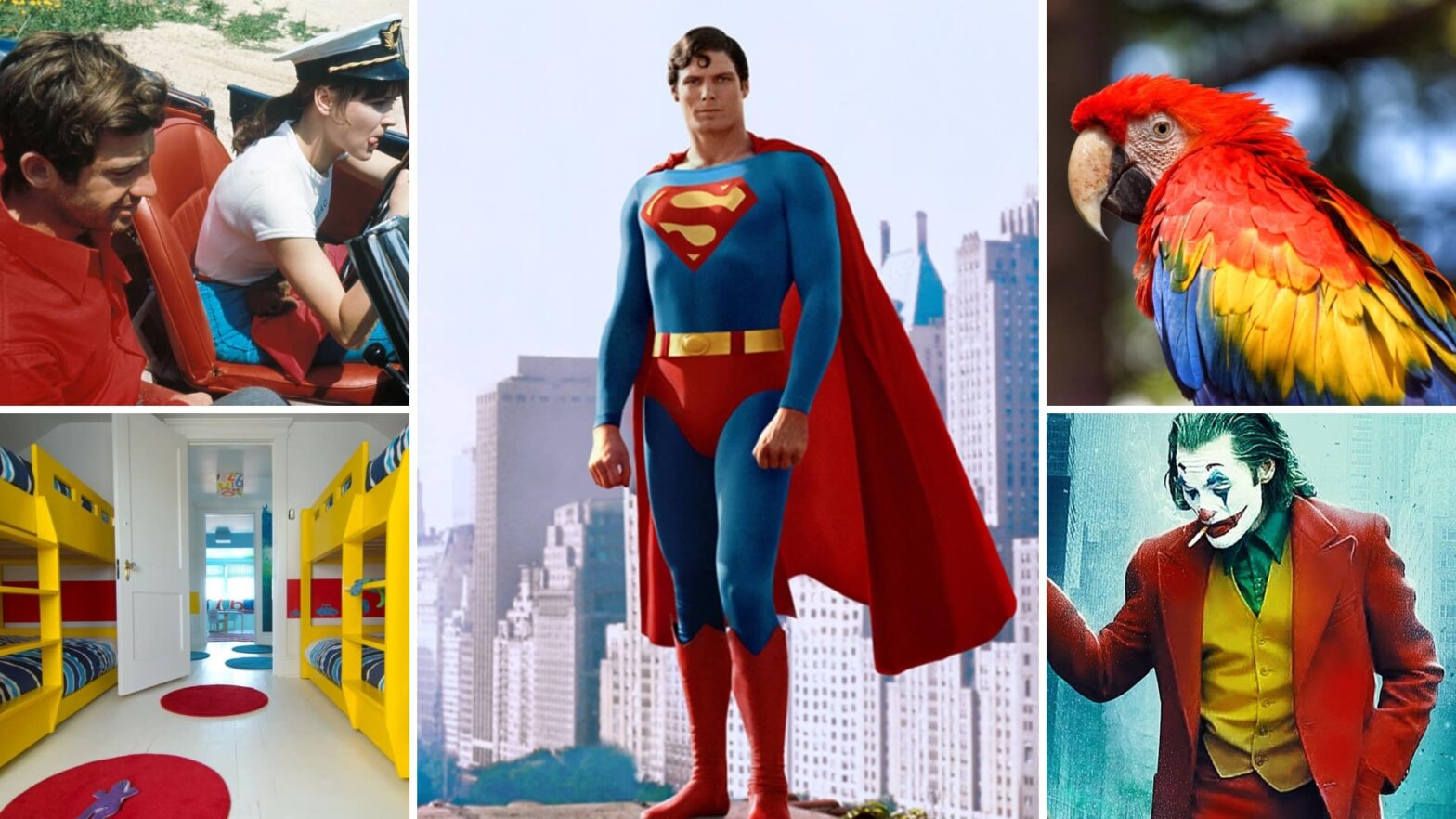
Pierrot Le Fou is an important film in the French New Movie cinematic movement known for rule breaking and wild experimentation. The film makes use of a red, yellow, and blue triadic color scheme. In this instance, the triadic colors perfectly fit with the film’s chaotic, constantly shifting narrative.
The discordance amongst the colors matches up with the discordance of the plot as it jumps between different genres and styles from scene to scene.

Triadic color scheme examples • Pierrot le Fou
To see these same three colors utilized in a different way, we look to Wes Anderson. In his films, Anderson's color palettes have experimented with and perfected just about every color scheme possible throughout his filmography. In his very first feature film, Bottle Rocket, Anderson made use of a triadic color scheme. These bold, saturated colors pop right off the screen.

Triadic color scheme examples • Bottle Rocket
But the triadic color palette is far from being the only one Wes Anderson has utilized throughout his career. Wes Anderson is a master of movie color palettes. He has experimented with and perfect just about every color scheme possible throughout his filmography. For an overview of his mastery of color, check out our video essay below.
Triadic color harmony and other color schemes by Wes Anderson • Subscribe on YouTube
Ang Lee’s take on the Incredible Hulk made use of a different triadic color combination. The green of the Hulk’s skin, the purple of his pants, and the orange of the desert rock make up a triadic harmony that blends real life colors with comic book visuals.

Triadic colors examples
There are so many creative ways in which to use color in cinema. The different color palettes at your disposal are near-limitless. Explore more movie color palettes and explore the thematic and psychological effects of color in your own film projects, and continue learning about color theory with the rest of our articles on color schemes.
UP NEXT
What is an Analogous Color Scheme?
Now that we know the answer to the question “what is a triadic color scheme?”, you can further your education on color schemes by reading our article about analogous color schemes. A knowledge of multiple types of color schemes is essential for any type of visual artist.
Up Next: What is an Analogous Color Scheme? →

Showcase your vision with elegant shot lists and storyboards.
Create robust and customizable shot lists. Upload images to make storyboards and slideshows.

