
Among artists, designers, marketers, and more, color is used as a powerful tool to communicate messages and evoke emotions. In design and art, color plays an indispensable role. It influences our moods, sways our decisions, and even shapes our perceptions of the world around us.
But to employ color effectively, one must understand its complexities and nuances. In this article, we delve into one of the fundamental aspects of color theory: color hue.
What is Color Hue in Art and Design?
First, let’s define color hue
In the realm of color theory, hue is often used interchangeably with color. However, it has a specific definition that differentiates it from other color terms.
COLOR HUE DEFINITION
What is color hue in art and design?
Color hue refers to the dominant color family of a specific color in the color spectrum. It's what we typically refer to when we say "red", "blue", "green", etc. It's the pure spectrum of colors without the influence of tint (white) or shade (black). Essentially, hue is the root or base of a color.
What is Color Hue Used For?
- Color Accuracy
- Color Mixing
- Balance and Harmony
- Creating Mood and Atmosphere
Distinctions Between Color and Hue
Color vs Hue
While 'hue' and 'color' are often used interchangeably, they aren't the same. Color is a general term that encompasses all possible shades, tones, tints, and indeed hues. It's an umbrella term for the entire spectrum of light waves visible to the human eye.

One Minute Design: What Is Hue?
On the other hand, hue refers to the pure spectrum colors in the color wheel. These hues are red, orange, yellow, green, blue, and violet, derived from the primary and secondary colors. Each hue can be altered by adding white, black, or grey, creating different tints, shades, and tones.
Hue vs Tint
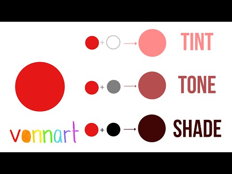
Understanding Hue, Tint, and Shade
Hue, as we've established, is the base or pure color. But what happens when you start adding white or black to a hue?
When you add white to a hue, it lightens the color, creating a tint. For example, adding white to red creates pink, a tint of the hue red.
On the opposite end, adding black to a hue darkens the color, creating a shade. If you were to add black to green, you'd get a darker, richer version of green.
Color Course • Tint, Tone, and Shade
Understanding these relationships between hue, tint, and shade is crucial for choosing color schemes, creating art, designing interiors, and more. It's the key to manipulating color to achieve the desired emotional or visual impact.
Related Posts
What is Color Hue Used For?
Why Does Hue Matter?
Hue, the foundation of color in art and design, holds immense significance. Its influence on a piece sets the tone, impacts color interactions, and shapes the viewer's perception. Both artists and designers rely on hues as fundamental elements, enabling them to create captivating works.
Color Psychology
In both art and design, hues are employed to convey messages and evoke emotions through color psychology. Designers leverage the psychological impact of different hues to elicit specific responses from their audience.
From marketing campaigns to product designs to cinematography in filmmaking, the selection of hues is meticulously considered to align with the intended message. Understanding the psychological associations of different hues empowers designers to create meaningful and impactful visual experiences. In this video, we take a look at the impact of color theory in film and how it deeply affects an audience.
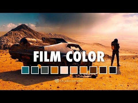
Color Theory in Film • Subscribe on YouTube
Color Accuracy
Hue plays a pivotal role in accurately representing colors in art and design. By understanding and utilizing the right hues, artists can faithfully recreate real-world objects and scenes.
Designers, too, rely on hues to accurately convey the intended message or concept in their visual compositions. The precise selection and application of hues ensure that the desired colors are faithfully represented to achieve accuracy and realism.
Designers, on the other hand, utilize hues to establish a cohesive and harmonious color scheme in various design projects, such as branding and packaging. The right combination of hues can evoke specific emotions and create a pleasing aesthetic that resonates with the target audience.
Color Mixing
Hue serves as the building block for color mixing, allowing artists and designers to create a wide range of colors. Understanding how different hues interact and blend together is crucial for achieving the desired color palette.
Artists can experiment with various combinations of hues to create captivating and visually appealing paintings, drawings, and sculptures. Similarly, designers leverage the power of hue to mix and match colors that harmonize and enhance the overall visual impact of their designs.
Color hue, although just one part of color theory, holds tremendous significance in the world of art and design. It plays a vital role in influencing our aesthetic choices and shaping corporate branding. Understanding hue allows us to effectively comprehend and utilize color to our advantage.
Up Next
What is a Color Scheme?
After understanding the importance of hue, the next step in mastering color theory is to explore another crucial concept - color schemes. In our next article, we examine different types of color schemes and how they are often used in design and art.
Up Next: What is a Color Scheme? →

Share your vision with elegant shot lists and storyboards.
Create robust and customizable shot lists. Upload images to make storyboards and slideshows.

