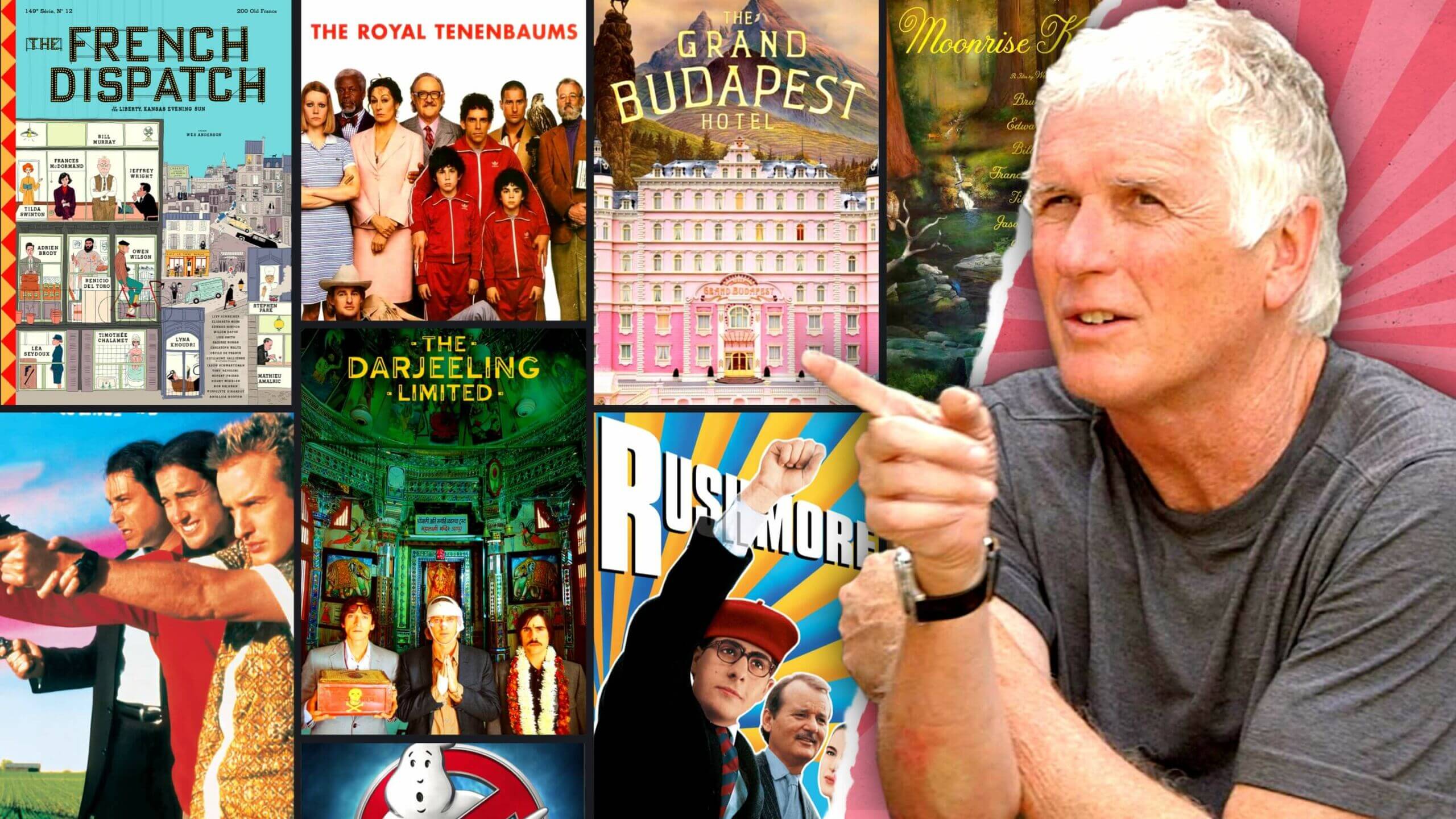
There’s little argument that Wes Anderson has one of the most distinct visual styles of any modern director. But Wes Anderson isn’t the only common factor in every live-action Wes Anderson movie: since Bottle Rocket, cinematographer Robert Yeoman has been by his side.
How does Yeoman create the style so immediately recognizable and beloved by Anderson fans? We break down four techniques in the director of photography’s toolkit.
Robert Yeoman Style
Symmetry is king
Any discussion of Robert Yeoman and his role in Wes Anderson's style would be incomplete without the mention of symmetry.
Bob Yeoman’s shot compositions in Wes Anderson films are incredibly detail-oriented, not a single hair out of place. Each frame has a feeling of extreme balance, achieving an almost dollhouse look.

At the center of everything • Wes Anderson cinematography
This often means throwing out the rule of thirds (having your subject/principle props located on vertices created by cutting your image into thirds). Notice in this still where the actor is placed — dead center.
We see this over and over again in Yeoman/Anderson enterprises:

“Please, sir, I was only slightly off center” • Wes Anderson cinematography
But symmetry doesn’t have to be achieved with a subject in the center. With two or more subjects, Robert Yeoman creates a similar balance:

Stiller’s had enough with the symmetry • Wes Anderson cinematography
Here, we have balance between our four characters, plus the emphasized empty chair, which is being pointed to both by the framing and the gaudy chandelier. Note how everything in the shot emphasizes this geometry: the two glasses of milk, the two sets of candleholders, the two candles on the walls.
We put more iconic stills utilizing this strategy in StudioBinder's storyboard software. Note how the locked, straight-on camera placement emphasizes geometric relationships between subjects.
Follow the image link to see each shot up close.
This type of framing lacks naturalism, almost nothing in life is this aligned. But a lack of naturalism isn’t necessarily a bad thing: from dialogue to performance to production design, Wes Anderson films are not trying to achieve realism.
Robert Yeoman, like any great cinematographer, is using visual style to compliment the director’s vision, not distract from it. Imagine an Anderson film with docu-style cinematography.
It would fall in the uncanny valley, creating an uncomfortable dissonance between the separate elements of the film.
This is a key lesson for any aspiring director of photography: while it’s important to bring your own style to a film, it’s equally important that the style meshes with the film’s other elements rather than detract from them.
Robert Yeoman Cinematography
Use anamorphic lenses
The intricate production design and staging of each of Robert Yeoman’s shots wouldn’t be nearly as pronounced were it not for Yeoman’s knack for wide anamorphic lenses.
By using extremely wide angle lenses, Yeoman is able to have a deep depth of field and panoramic layout, further adding to the dollhouse quality of Anderson pictures.

Anamorphic on display • Wes Anderson cinematography
In this shot, you can see the slight fisheye effect of the anamorphic lens, an effect which has become a staple of Anderson films.

Note the bend in the train tracks
This use of wide anamorphic lenses further stylizes each frame of a Wes Anderson film — the distortion of perception reminds us of the unreality of it all. The deep depth of field also allows for there to be multiple subjects in multiple locations in a shot. Take a look at this set up in Rushmore:

Robert Yeoman cinematography
Here we have two subjects, Max and Rosemary, at differing distances from the camera. Were this shot on a longer lens, this effect would be impossible; we would have to choose either Max or Rosemary to focus on. As it is, Max’s object of affection is in focus, and yet there is still a distance between the two of them.
Robert Yeoman utilizes this two-shot method repeatedly. Notice how close the camera is to the subjects in this behind-the-scenes photo:

The Grand Budapest Hotel cinematography
Here, too, M. Gustave and Zero are at different distances from the camera. The only way to get both of them in focus would be a super-wide lens, and that’s what Yeoman’s opted for.
Related Posts
Robert Yeoman Style
Don’t be afraid of color
It’s common practice today to desaturate your film to near black-and-white. This might achieve a multitude of ends: a gritty realism, an indication of dark subject matter, an emphasis of monotony.
But it also can run the risk of looking… boring.
Yeoman is a cinematographer who embraces bright, striking colors in almost all of his work. This simple practice makes Wes Anderson films stand out among the desaturated (yes, The French Dispatch has some black-and-white scenes, but you get the point).

Colors pop • Robert Yeoman cinematography
But Yeoman doesn’t just use bright colors for bright colors’ sake. His use of color is purposeful and multifaceted. Take the above still. The bright red (along with the simple framing) immediately draws our eye to Pelé. Furthermore, his baby blue suit perfectly compliments the purple sunset behind him. The colors are working together to direct focus and create an idyllic landscape.
Yeoman also uses color to establish setting. Think of Moonrise Kingdom, for example, and its heavy use of yellow.

Robert Yeoman photography
The deep greenish-yellow is immediately evocative of summer, which is key to Moonrise Kingdom, a story revolving around summer love.
Note, too, just how consistent the coloring is in the above frame. Everything in the shot — from the tent siding to the camper outfits to the floor — works towards a distinct, coherent color palette.
Bright colors are often associated with upbeat emotion. But Yeoman will often use bright coloring in dark scenes too:

Beautiful blue! Wait a minute… what’s going on here?
The color palette of this iconic (and very dark) Royal Tenenbaums scene isn’t blacks and grays. Instead, Yeoman opts for a light blue. It’s an unexpected color choice and it works wonders. A darker, less colorful scene would have been far less impactful.
In this video, we dive into Anderson's use of color and the juxtaposition he creates between bright, happy colors with dark, existential stories.
Wes Anderson's Colors • Subscribe on YouTube
And speaking of darkness...
Robert Yeoman Style
Light lots, light soft
There are very few shots you’ll find of Bob Yeoman’s that are not well-lit. Even for scenes taking place at night, you can see everything clearly:

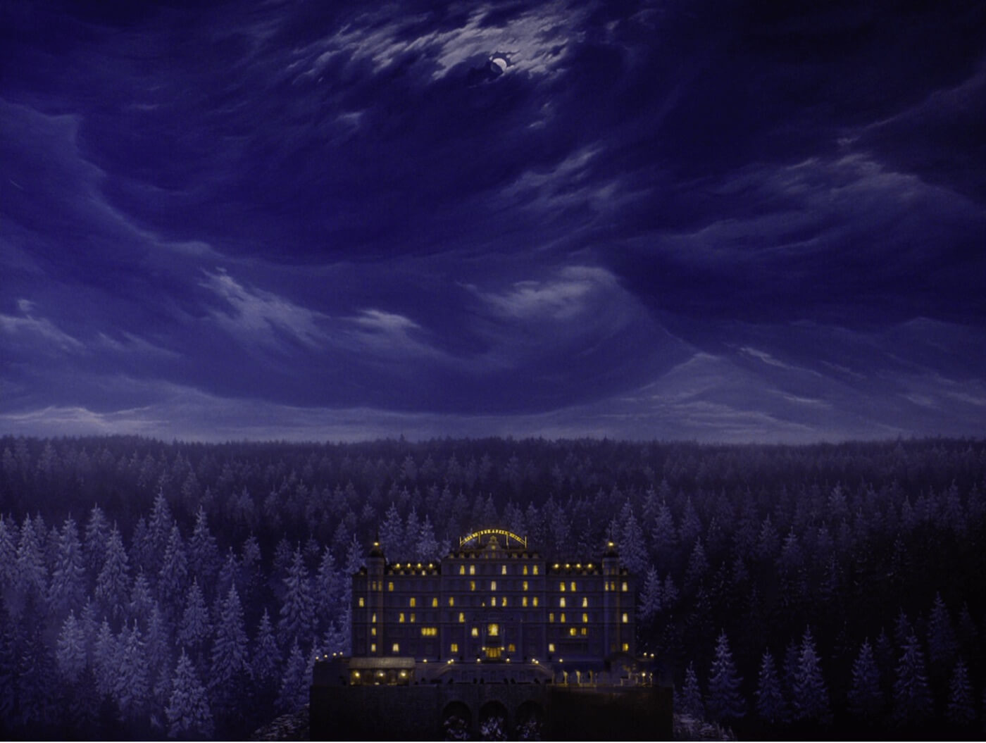
The Grand Budapest Hotel cinematography
This broad, soft lighting highlights all of the elements of Robert Yeoman’s cinematography that we’ve discussed so far. The symmetry, color, and all-encapsulating wide angles benefit from sets bathed in light.
Watch Robert Yeoman himself discuss his approach to lighting:
Robert Yeoman interview
Interestingly, Yeoman’s hyper-stylized nature does not carry over to his lighting techniques. Instead, he opts for naturalism, trying to utilize the sun, windows, and other ambient light to illuminate his cinematography.
This type of soft lighting is ideal for comedy. This is why Yeoman is also a favorite DP of Paul Feig, director of Bridesmaids, The Heat, and Spy.

Robert D Yeoman cinematographer
For improvisational films like these (all of which were shot by Yeoman), it’s key to give actors freedom to ham it up and not be restricted to narrow dynamic lighting. This is especially important to capture all the physical comedy on display. Whether it's a broad comedy or an autuer's particular vision, Robert Yeoman sure knows how to use cinematography with precision and style.
UP NEXT
Robert Richardson’s Style
Now that you’ve learned the techniques of one famous DP, why not learn the techniques of another? Robert Richardson has worked with the likes of Quentin Tarantino and Martin Scorsese. Like Bob Yeoman, his work’s nothing to sneeze at. In fact, there's plenty to learn from.
Up Next: Richardson Techniques →
Showcase your vision with elegant shot lists and storyboards.
Create robust and customizable shot lists. Upload images to make storyboards and slideshows.

