In the world of screenwriting, details matter, and one such detail that carries significant weight is font choice. The font used in a screenplay isn’t merely an aesthetic choice but a fundamental aspect that impacts readability, standardization, and even timing. So, what is the proper screenplay font? The answer is simple but the reasoning why is fascinating. Let’s go!
Watch: Anatomy of a Screenplay

What Font Are Scripts Written In?
First, let’s define screenplay
The seemingly minor decision of selecting a font can have major implications on how your screenplay is received by readers and industry professionals. Before we dive in, let’s set a foundational definition of what a screenplay is.
SCREENPLAY DEFINITION
What is a screenplay?
A screenplay in film, also known as a script, is a written work that forms the basis for a movie or television show. It contains detailed instructions for everything that appears on screen, including character dialogue, actions, and settings. The screenplay guides the director, actors, and crew through the narrative, helping them bring the story to life. In essence, a screenplay serves as the blueprint for a film, outlining its structure, pacing, and visual elements.
Importance of Font in Screenplays:
- Readability
- Standardization
- Timing
What Font Are Scripts Written In?
The Standard: Courier 12
Courier 12 has long been the industry standard font for a screenplay. But why has this particular font style held its ground in an industry that is constantly evolving and embracing changes?
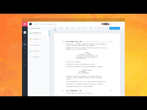
One of the main reasons is its readability. Courier 12 is a monospaced or fixed-width font, meaning each character occupies the same amount of space regardless of the letter. This uniformity makes scripts easier to read and skim through, which is crucial when script readers often have stacks of screenplays to go through. Here is an example of a screenplay page in proper font and format using StudioBinder’s free screenwriting software.

A screenplay example page • Screenwriting Font
Another reason is tradition and standardization. The film industry has been using this font since the days of typewriters. Using Courier 12 ensures that all scripts have a uniform look, making it easier for industry professionals to compare and evaluate them.
Lastly, there's a practical reason related to timing. In screenwriting, one page of text roughly equates to one minute on the screen.
The use of Courier 12 helps maintain this rule as its size and spacing roughly translate to this timing. All these factors combined make Courier 12 the undisputed screenplay font standard.
Related Posts
Movie Script Font
Impact of Correct Font Use
The choice of font in a screenplay has a profound impact on various aspects of the script and its reception. Here's how the correct font choice influences readability, standardization, and timing in screenwriting.
Readability
The right font ensures that your screenplay is easy to read, which is crucial for script readers and industry professionals who often have to go through stacks of scripts. A font like Courier 12 is clear and legible, reducing strain and facilitating quicker reading and comprehension.
This ease of reading can make a significant difference in the reception of your script. Take a look at The Godfather screenplay to see this in action.


The Godfather Screenplay • Font For Writing Scripts
Standardization
Standardization is another critical aspect influenced by font choice. Using a standard font like Courier 12 maintains consistency across the industry, making scripts easier to evaluate and compare. It ensures all scripts have a uniform look and feel, making it easier for industry professionals to focus on the content rather than getting distracted by varying formats and styles.
Timing
Maintaining accurate timing is a crucial element of screenwriting, and the choice of font plays a significant role in this aspect. In the film industry, each page of a screenplay roughly equates to a minute of screen time. A standardized font like Courier 12 helps maintain this timing accuracy due to its size and spacing. Any deviation from this standard can lead to timing inaccuracies, misrepresenting the pacing of your story.
The choice of font in a screenplay isn't just an aesthetic decision but a strategic one that significantly impacts readability, standardization, and timing. It's about ensuring that your script accurately communicates your narrative and facilitates a smooth production process.
Related Posts
Up Next
How to Write in Screenplay Format
Now that we've explored the importance of font choice and its impact on screenplay writing, it's time to delve deeper into the world of scriptwriting. In our next article, we'll guide you through the intricacies of screenwriting format, ensuring your script not only reads well but also adheres to industry standards