
If you’ve ever watched a show, movie, or commercial with words on the screen, you’ve likely seen lower thirds at work. But what is a lower third? And how can you create them effectively, while maintaining aesthetic integrity? A slick design with strategic font and color choices will add a layer of professionalism to your project. Here are some tips on how to make that happen, including tutorials and templates for lower thirds in After Effects, Premiere, Photoshop, Final Cut Pro.
Lower Thirds Meaning
What does lower thirds mean?
Lower thirds can be a necessary evil. You need to give your audience pertinent information but you also don't want it to be distracting. They're supposed to visible and invisible at the same time, but how is that done Before we go over these strategies with examples, let’s quickly define what lower thirds are.
LOWER THIRD DEFINITION
What is a lower third?
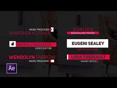
A lower third is a combination of text and graphical elements placed in the lower area of the television screen to give the audience more information. It doesn’t necessarily have to occupy the “lower third” of the screen, but that's where it gets its name. They might seem trivial, but their necessity is clear when they're used poorly or missing altogether which can confuse the audience.
When might be a good time to use lower thirds? If you’re filming a documentary, or any other interview-type program, keeping track of all of the subjects can get confusing without lower thirds.
If the show, company, or film has a certain tone or aesthetic, it’s good to keep the lower third design "on brand." All of the elements of the lower third should work together to add to the visuals, not distract from them.
ELEMENTS OF A LOWER THIRD:
- Color
- Typography
- Animation Style
- Size and Position
- Shapes and Logos
Typography
Make sure your font style is in line with the project’s tone and brand. It needs to be readable and least distracting as possible. Also, avoid lengthy text — keep it short and to the point.
Shapes and Logos
If you’re editing for a company, chances are they have their own style guides to follow, and their logo is pretty much set in stone. But you can choose shapes that help both the logo and typography stand out.
Make sure shapes, logos, and text work together
Color
Avoid distracting colors and using too many at the same time. Stick with the color scheme of the logo and aim for just one or two colors. When you pick a color that complements the background, it will attract attention without taking away from the content. Also if you use contrasting colors between the background elements and typography, your text will stand out.


Use colors that go well together
Size and Position
This really depends where your subject is on the screen. Your text or graphic doesn’t have to be in the lower third. Keeping symmetry in mind helps with this. If you’re interviewing someone and they their eye-line is in the upper third, it may be a good idea to put their name in the lower third. *Also, make sure they’re in a title-safe area. They should never be blocking something that the viewer needs to see.
Animation
To animate or not animate. Try not to go overboard with this, but don’t be scared of it either. You can animate any of the elements above — text, logo, words, etc. These usually work best during an intro, outro, or some kind of transition. Again, always ask yourself if your designs are distracting from the content.
LOWER THIRD TEMPLATES
Tutorials and templates
We've collected videos with step-by-step guides on how to use lower thirds templates in Final Cut Pro, After Effects, Photoshop, and Premiere. Each video also comes with downloadable templates and other resources that will add some fuel to your lower thirds fire!

Lower thirds in FCP
Lower thirds in After Effects

Lower thirds in Photoshop

Lower thirds in Premiere
Up Next
Best lower thirds templates
Now that you know what lower thirds are, let’s put them into action. This post provides the best templates from Premiere to get you started. It also includes more technical considerations and strategies to make sure you're maximizing the benefits of your lower thirds without distracting the audience or underselling your project.
Up Next: Lower thirds templates →

Share your vision with elegant shot lists and storyboards.
Create robust and customizable shot lists. Upload images to make storyboards and slideshows.

