
T
here comes a point in every video project when you should consider how you’ll use text graphics. Maybe you need lower thirds to fill the audience in, or an eye-popping titles sequence to establish your project’s mood. Solving how to add text to a video can be overwhelming.
We’re here to help. Today’s blog post will dissect current trends of how text graphics are used in films, TV and online today. We’ve combed through many examples — including different types of fonts, kinetic typography, and lower thirds — to show how they’re used.
By the time you’re done reading, you’ll know the current trends in text graphics and which projects used them well. Prepare to be wowed by the written word, and to capture some typographic inspirations for your own designs.

Watch: Top Text Graphics Trends
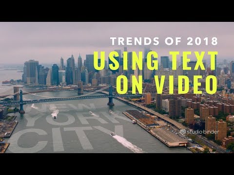
Text Graphics in Video: Top Trends
1. Definitions and applications
To define text graphics, we should first define what typography is. To put it simply, it’s the appearance and rendering of the text in your video. It covers the size, arrangement and appearance of your letters.
In video, text appears in a multitude of ways. It could be in film credits, lower-third graphics, or even as visual overlays of what your characters are texting.
The best uses of text in video blend the important typography rules with live and motion graphics elements. This is the essence of what text graphics are.
We have identified a few trending looks we’ve seen to make your text graphics snap, crackle and pop in your project.
TEXT GRAPHICS IN VIDEO
2. Big and bold typography design
One thing that’s really in right now is making your text graphics really big and bold. Taking them to the macro level like this this creates a profound typographic effect.
One of the best film title sequences this year was in M. Night Shyamalan’s Split. Its sinister Helvetica opening titles speak volumes.The macro typography design in the “Split” film credits sets the horror mood
The size and appearance of the text establishes a horror vibe. As the sequence starts to intercut with live action footage, the large font on the title cards has an overbearing and menacing effect.
A similar typographic example is found in Netflix’s Mindhunter series. This big, bold text graphic announces the show to an unsettling degree.

The typography design of the titles in “Mindhunter” is big, bold and unsettling.
Related Posts
text graphics in video
3. Visuals inside text graphics
A few recent opening titles examples have letters with visual elements inserted. Stranger Things uses this to create an alluring, retro chapter introduction.

Stranger Things 2 - Opening Credits
As you can see, the letters serve as a sort of doorway into the video. The opening shot of “Stranger Things” is embedded within the typography design of the title.
Since the opening shot is literally inside the episode title name, you’re already anticipating the first scene.
Another show that has done this for an appropriately stylized effect is The Deuce. The title sequence design features glitzy 1970’s Times Square footage.

Then the imagery appears in the main title itself.
TEXT GRAPHICS IN VIDEO: TOP TRENDS
4. Laying video elements over the text
In an inverse approach, we have also title sequences that obscure the text with visuals. Probably the best example we’ve seen is in American Horror Story: Cult. The opening credits feature a montage of eerie characters interacting with the various names.
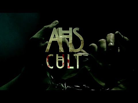
American Horror stories cult main titles
In one example, a character throws a smoke bomb. As Cheyenne Jackson’s credit appears, the smoke bomb mists over the letters. It creates a truly immersive 3D effect.
Learn More Logos Ethos and Pathos
Comparing other techniques
There are many types of rhetorical strategies to persuade an audience. To get a full picture on how they work together, or when to use which rhetorical strategies, explore the full guide below.
Explore More Rhetorical Strategies
Each of these rhetorical strategies can be effective in its own way. When combined, their potential effects grow exponentially.
common text graphics
5. Fonts that move
Animation also can make your text more enmeshed with the video content itself.
One of the best opening titles sequences of 2017, by far, is Spider-Man Homecoming. With a beautifully “hand-drawn” aesthetic, the text feels fully alive. The jittery effect matches the cartoonish illustrations and the Ramones song choice.
And with the animated text, it feels all the more embedded into the visuals.
TOP TRENDS IN TEXT GRAPHICS
6. Kinetic typography
You might also want to consider moving your text in a more dynamic way. Kinetic Typography (or “kinetic text”) is a big trend that is overtaking video text graphics today. Essentially it’s motion typography: it moves across the screen like it’s being typed or revealed in real time.
Apple used extensive kinetic typography design in their promo for the iPhone X.
Promo for the iPhone X
The impact is immediate. The kinetic type flies in, pops up and writes out word for word. It’s so interwoven with the visual elements that you’re more watching it than reading it.
Kinetic typography is also an effective way to present lower thirds. For example, The Lego Batman Movie used kinetic typography to establish its locations.
It’s an easy and effective technique. Just find a good kinetic typography template to get your text moving as needed.
Related Posts
text graphics and trends
7. Texting on screen
It’s probably safe to say we’re all pretty attached to our cell phones. So naturally the characters we watch will be too. This presents a challenge to filmmakers. How to relay so much text in a video?
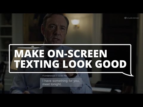
Make onscreen texting look good
Use screen texting like you would use kinetic typography. Consider a dynamic way or place to pop in your text. To avoid constant cuts to characters’ phone screens, find tasteful ways of inserting them into the shot itself.

A very kinetic type of screen texting, from “Men, Women and Children”
Sometimes you have to show a phone or computer screen. Maybe your character is Google searching something. In these instances, think about how to arrange your shots to reveal the text in a compelling way. Close ups into the words can reveal the content itself beat for beat.
The point is, if you have to show text on-screen, make it part of the story.
TOP TRENDS FOR TEXT GRAPHICS
8. Lower thirds that pop
Lower thirds is an info card that appears somewhere on your frame. It can hold a subject’s name, a location, or other information important to your viewer.
They should be as compelling as possible, but without drawing too much attention to itself. To maximize lower thirds, first think about the content itself. If you’re working for a brand, consider their fonts, color choices, and overall design they typically implement.
PBS shares a handy style guide with their affiliates on how to make awesome lower thirds.

Lower Thirds that pop
The color, type size and placement is all very strategic for guiding your eye to what is important. The image strongly sells that this program is about India. The orange on the title pops against the dark image, as does the purple on the air time.
If you do not have client references to work from, consider the overall project. What colors does it evoke? What fonts would best fit the subject matter. Find a good guide on title design principles to further guide your thinking on this.
Related Posts
up next
Top Mood Board Apps
The way we consume video is changing. Video feels like it’s nested everywhere: in social media, on devices on the go, and sometimes it catches us by surprise in pop-up ads. More and more, when you add text to a video it must be eye-catching and immediate. If you want to keep track of the text uses that you liked the most, consider capturing them in a mood board.
Up Next: Top Mood Board Apps →

Project management for video creatives. Tasks, file sharing, calendars and more.
Manage video production timelines, tasks, storyboards, shot lists, breakdowns, call sheets. Made for video creatives, new media and film.

