
Akira Kurosawa said, “To be an artist means never to avert one’s eyes.”
Throughout a long and varied filmography, the Japanese auteur compelled his audiences through scenes of loving intimacy as well as suspenseful drama.
Although the director’s eye for detail was apparent from his debut, some of his most striking imagery occurs in four late color films.
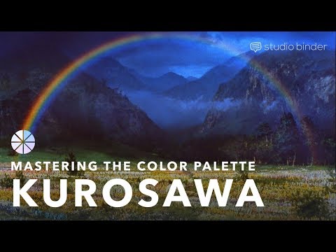
In this post, we’re going to review Akira Kurosawa’s approach to choosing a color palette, and provide a free Akira Kurosawa color grading LUT Pack you can use on your next project.

How to Create a Movie Color Palette like Akira Kurosawa
How To Create A Movie Color Palette Like Akira Kurosawa
Associative Colors
Associative colors are linked to specific characters or ideas throughout a film. The purpose of an associative color palette is to strengthen the themes of the narrative. Perhaps one of the more prominent and most used of associative colors is red.
Red can represent love and passion, but it can also represent violence, danger and power. Consider Akira Kurosawa’s Ran for example.

Akira Kurosawa movies use red to highlight lust and violence. Ran (1985)
Here, Kurosawa uses red to show the lustful and violent desires of men.
The pursuit of power is at the heart of many Akira Kurosawa movies.
Whether it’s achieving dominion over a romantic relationship or a foreign land, these male characters struggle with finding the routes that will lead them to positions of strength and stability.
For Kurosawa though, violations of flesh, both sexually and militarily, have consequences.
By using red during these pivotal moments, Kurosawa enables the authority and fragility of his characters to surface.
HOW TO CREATE A MOVIE COLOR PALETTE LIKE AKIRA KUROSAWA
Complementary Colors
Complementary colors lie opposite one another on the color wheel.
These dueling colors are often associated with conflict, whether that be internal or external.
Akira Kurosawa movies recognize this, and often utilize the color scheme when portraying moments of war.
Take Kagemusha for instance.

Akira Kurosawa movies contrast armies by using complementary colors. Kagemusha (1980)
Although separating army battalions by color is common practice, Akira Kurosawa takes the opportunity to use a complementary color palette in showcasing family conflict as well.
As more details about Shingen Takeda’s death come to light, the outfits of Katsuyori Takeda and the Kagemusha contrast with their surroundings, highlighting their insecurity and envy over Shingen’s legacy.
For Akira Kurosawa movies, contrasting colors reflect not only wars fought on the battlefield, but those between family members as well.
HOW TO CREATE A MOVIE COLOR PALETTE LIKE AKIRA KUROSAWA
Discordant Colors
A discordant color palette draws attention to the importance of a character or moment.
These deviations from a film’s color scheme are often used to refocus a viewer’s attention on specific thematic elements.
However, Akira Kurosawa movies do not shy away from the ambiguity these objects offer.
Take Kurosawa’s Dreams for instance.

Akira Kurosawa movies use color dissonance to help characters stand out. Dreams (1990)
Here, does a pink flower represent purity or temptation? Does a red light signal salvation or destruction?
Yes, Akira Kurosawa films want these clashing colors to reveal vital narrative information.
But by refusing to hold the elements to a specific meaning, the director opens the doors for greater interpretation, and solidifies the richness of the story.
When trying to reveal important narrative information, consider utilizing color discordance.
HOW TO CREATE A MOVIE COLOR PALETTE LIKE AKIRA KUROSAWA
Triadic Colors
Triadic colors are three evenly-spaced hues on the color wheel.
Typically, one color is dominant while the others are accented.
Often, Akira Kurosawa films use a triadic color scheme to heighten the reality of a scene.v

Akira Kurosawa movies combine triadic colors to heighten realities. Dreams (1990)
Whether in the landscapes of the rural countryside or a dream , Akira Kurosawa films use abstraction to their advantage.
For Kurosawa reality is a relative term, and what’s more important is using color to strengthen the accomplishments and failures of his characters.
When used appropriately, a triadic color scheme can significantly reinforce the themes of a story.
UP NEXT
Movie color palettes to inspire you
It’s often said that color is a language unto itself. Here are some amazing color palettes from movies to get your creative cinema juices flowing. Download the free Ebook at the end to use as a reference
Up Next: 50+ Movie Color Palettes →

Share your vision with elegant shot lists and storyboards.
Create robust and customizable shot lists. Upload images to make storyboards and slideshows.

