
What are monochromatic colors? What is a monochromatic color scheme in filmmaking? Why does it matter and how is it different from other color palettes? These are the questions we’ll be answering alongside a dive into the purpose and psychology of color in storytelling and a look at some of the best examples of monochromatic color schemes from film and television.

Watch: Color Theory in Film
Subscribe for more filmmaking videos like this.
Monochromatic Definition
Define monochromatic color scheme
A monochromatic color scheme can make for an exceptionally stylish look when applied to a film or a television show. When we think "colorful" imagery, we probably image many different colors. But there is plenty of variety within a single hue that can make equally dynamic and colorful images.
To learn more about the different types of color schemes at your disposal as a filmmaker, be sure to read our articles on complementary, analogous, and triadic color schemes as well.
MONOCHROMATIC COLOR SCHEME DEFINITION
What is a monochromatic color scheme?
A monochromatic color scheme is a color palette in which a single color tint is used as the basis for all shades and hues found within the image. The shade of color is varied by changes made to the saturation and/or brightness of the base color. White and black are always present as the two extremes on either end of the spectrum for whichever color is chosen for the monochromatic color scheme.
Monochromatic Scheme Characteristics
- Based upon a single color
- Includes the various shades and hues of the base color
- Black and white can be present
For the full explanation of color schemes and color theory, download our FREE ebook: How to Use Color in Film.
Cinematography techniques pdf
FREE Download
How to Use Color in Film
Hue, saturation, brightness — the three elements of color that make all the difference. In this book, we'll explain the aesthetic qualities and psychology effects of using color in your images. Topics include color schemes like analogous and triadic colors and how color palettes can tell stories of their own.


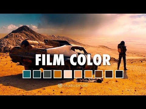
Example of a monochromatic color scheme
What does a monochromatic color scheme look like?
Monochromatic color combinations can create a unified look for a piece of work. There is no limitation as far as choosing which color to build your monochromatic color scheme around. Any tint can be chosen as the base color for your color scheme, with its associated shades filling out the rest of your monochromatic colors.
All black and white films fall into the monochromatic category. Black and white are present at the extremes of each and every color, meaning solid black and white can be included in a monochromatic scheme built around any color. The various shades between black and white in the absence of other colors make up the grayscale look that black and white films employ.

Monochromatic color combinations begin with black and white
The word “monochromatic” derives from the root words “mono,” meaning one, and “chroma,” meaning color. It is important to keep in mind that while a monochromatic color scheme is built entirely around a single color, that does not mean that it is built around a single shade.
Varying the shades through changes to the brightness and saturation of the base color is key in providing an image with depth and visual appeal.

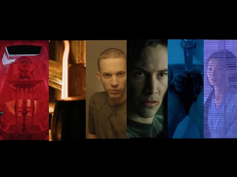
An example of a monochromatic color scheme in The Matrix
One of the best action movies The Matrix is built around a monochromatic color scheme with green as the focus color, but you can find a great deal of variance within the values of green found in each frame.
The following video showcases a number of film color schemes and underscores the unifying characteristics of a monochromatic approach.
What are monochromatic colors? • Color psychology in film
Color has a massive impact on the way in which viewers perceive any given image. The impact can be aesthetic in nature but can often be a subconscious, psychological effect as well.
Related Posts
What are monochromatic colors?
Why use a mono color scheme?
The psychology of color can hold significant influence over the response to an image. Certain colors can evoke particular subconscious reactions when utilized properly. To understand this subconscious relationship and learn how to make the best use of these psychological effects in storytelling, we need an understanding of color theory.
A Ted Talk on the psychology of color
When utilizing colors for their psychological effects, a filmmaker can determine their own color associations as established within the film, or they can rely on the pre-established associations for particular colors. Whether you realize it or not, certain colors evoke certain psychological responses in the human brain at a subconscious level.
These pre-determined associations have been re-inforced throughout generations of storytelling for both the subconscious associations and for the thematic relevance. Refer to the helpful chart below for some of the most common responses associated with particular colors.

What are monochromatic colors? • The psychology of color visualized
The limits of color in storytelling are boundless. It is true that there are plenty of films that disregard color as a creative choice. Or they opt instead for a color scheme that purely represents our real-world and nothing more. There are also countless examples of excellent films which make color a key element of their overall style and meaning. This tribute to color in storytelling showcases the power of meaningful color scheme choices.
Consider the work of an auteur director like Wes Anderson. He uses color in a very interesting way — to balance sad characters and dark subjects with bright and saturated color palettes. For more, check out our video on this theory.

Our guide to the colors of Wes Anderson • Subscribe on YouTube
Be sure to pay color the attention it deserves when making your own movies. Our script breakdown software is a great tool for identifying all of the production design elements in a screenplay that can be geared toward a meaningful color scheme. You can get started for free today.
Related Posts
Monochromatic color scheme examples
Monochromatic color scheme examples
Now that we have a clear understanding of the what and why of monochromatic color schemes, let’s take a look at a few monochromatic color scheme examples in action in movies and TV shows.
As we saw earlier, Wes Anderson is a master of color palettes, and nowhere has he better utilized the monochromatic color scheme than in one of the best 2014 films The Grand Budapest Hotel. For further analysis, check out our article on the color palettes of Wes Anderson.

Wes Anderson is a color palette master • What are monochromatic colors?
Denis Villeneuve is another modern master of the color palette. We have a full post all about how Denis Villeneuve crafts the color palettes of his films that you can check out for a more detailed breakdown of his color usage.
Villeneuve has covered the gamut of color schemes in his movies from bright and saturated in Blade Runner 2049 to grim and desaturated in Prisoners. But his most psychologically driven monochromatic color palette can be found in his 2014 thriller Enemy. The bold yellow color scheme of Enemy is a key part of the enveloping sense of dread Villeneuve crafted for the film.

A monochromatic color scheme contributes to the sense of dread
Zhang Yimou’s 2018 action-drama The Shadow features stunning cinematography with a bold black-and-white monochromatic color scheme despite not actually being shot in black and white. The Shadow is shot and presented in color but every single location, set, wardrobe choice, and production design element was carefully designed to match the black and white aesthetic of yin and yang.
See how the monochromatic color scheme of The Shadow was pulled off in the collection made using StudioBinder's storyboard creator below.

The Shadow’s gorgeous black and white style • See the full collection
Hero was another Zhang Yimou film that pushed the limits of a monochromatic color scheme to new heights. The film made use of multiple mono color schemes throughout its runtime, progressing through each color palette in accordance with the progression of the different chapters of the story. Each section of the film is assigned a specific monochromatic color scheme to best represent the themes and perspective of that specific segment.

Hero’s color segments
Another Netflix original series to feature a striking monochromatic color scheme is Ozark. Anyone who has seen Ozark instantly associates the show with the color blue. Everything, including the green foliage of the environment and the skin tones of the actors, is tinted blue.

Ozark is washed in blue
There are truly no limits when it comes to using color in bold and creative ways. Explore the thematic and psychological effects of color in your own film projects, and continue learning about color theory with the rest of our articles on color schemes.
Related Posts
UP NEXT
What is an Analogous Color Scheme?
Now that you can answer the question “what is a monochromatic color scheme,” continue your color education with our article all about analogous color schemes. A knowledge of both monochromatic and analogous color schemes is essential for any type of visual artist.
Up Next: Analogous Color Schemes →

Share your vision with elegant shot lists and storyboards.
Create robust and customizable shot lists. Upload images to make storyboards and slideshows.

