
You can tell a lot about a movie based on its color palettes. Color evokes mood and tone. And few directors understand this quite as idiosyncratically as Wes Anderson. In pretty much all of his films, you could take any single frame and learn so much about the characters or plot. And it all comes down to how he uses color. For this blog, we’re breaking down a single Wes Anderson color palette from each of his movies to see what we can glean across his filmography and how his use of color plays with costumes, character development, and themes. Let’s dive in.

Watch: How Wes Anderson Subverts Color Theory

Subscribe for more filmmaking videos like this.
USE OF COLOR IN FILM
Hue, saturation, and brightness
Before we go into Anderson’s filmography, it’s important to have a basic understanding of how to present colors in film. This comes down to knowing your HSB, which can also be known as the DNA of color. If you look at our post on how to use color in film, then you’ll find that different colors correlate to different moods. These associations we have with color comes down to the levels of HSB.
Hue
Hue is the color or shading. An example of a hue could be red or bluish-green. Your typical Wes Anderson color palette will have a lot of primary colors, such as red, blue, and yellow.
Saturation
Saturation is the degree to which something is absorbed or dissolved compared to what’s possible at the maximum. It’s typically defined as a percentage.
Therefore, if red is a hue, then saturation relates to how red it is. You can have a muted red or something much more vivid. For Wes Anderson, his saturation tends to be as high as possible. So when you see a red beanie or jumpsuit, it stands out.
Brightness
Brightness is how light of dark a given color appears. It’s the perceived intensity of how much light a color gives off on the screen.
Wes Anderson likes to keep things as bright as can be when possible. But when he decides to go dark, he goes all in there, too. You can see this at play in his film, The French Dispatch, which has large portions of the film in black and white. For a complete breakdown of Wes Anderson's directing style, including his fantastic use of color, we've got it all in this video.

Wes Anderson's directing style and contrasting color palettes • Subscribe on YouTube
Let’s examine Anderson’s directing style to see how his use of color has evolved throughout the years, starting with his first film.
WES ANDERSON PALETTE
Bottle Rocket (1996)
If there are two main Wes Anderson colors, it’s red and yellow. While it may not be as bright and vivid as his later pictures, Bottle Rocket gave us a taste of what your typical Wes Anderson color palette might look like.
Here's a quick look back at the making of that film.

Wes Anderson & Bottle Rocket • Subscribe on YouTube
Throughout the film, Anthony is defined by his signature red sweater. Meanwhile, Dignan is usually found in yellow outfits. It should be noted that the third member of their syndicate, Bob, is typically in black and white, never taking away too much attention from our two leads.

Wes Anderson Style for Bottle Rocket
The above color palette portrays the main colors we’ll use to identify each of the main characters throughout the rest of the film. Understanding these colors helps us track their arcs later.
To pull off the heist, Dignan wants everyone to wear yellow jumpsuits. While Anthony breaks off from Dignan’s path for a while, he eventually relents, donning the yellow jumpsuit Dignan’s wearing.

Everyone's aboard team Dignan (yellow)
Not only does this depict Anthony has adopted his partner’s world view, but he's also willing to put everything on the line for their big score. Anthony's character development can literally be tracked by what he's wearing.
Of course, everything goes sideways.
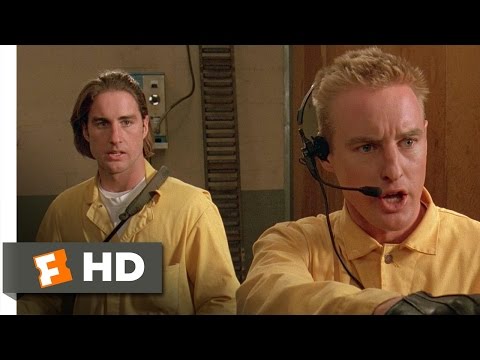
Bottle Rocket • The Job Falls Apart
The hues Wes Anderson is predominantly interested in are there with his first film. But it would be later until saturation and brightness would come more into play.
WES ANDERSON AESTHETIC
Rushmore (1998)


Early Wes Anderson Movie Color Palette
Wes Anderson’s sophomore effort may appear more muted as well, but his color choices are still distinct and defining. Let’s look at this frame, which is encapsulated by blues.
In basic color theory terms, red is often associated with anger or passion. Yellow can communicate naivety. And blue is often used to point to calmness and intelligence.
It’s made clear that Max’s grades aren’t the best, but Max's intelligence still shines. Anderson associates the color blue with Max frequently; from his trademark blazer to the production design surrounding him.

Rushmore • Opening Scene
Blue comes up frequently in the film. After all, it’s part of the school uniform. But by making Max’s jacket more saturated than his peers, it helps him stand out and shine brighter and more adroit.
The blue blazer is often paired with red; be it his tie, or this beret.
Not only does this combination communicates Max's desire to be seen, but it also underscores his passion, as the color red so often does.
WES ANDERSON PALETTE FOR ROYAL TENENBAUMS
The Royal Tenenbaums (2001)


Wes Anderson Movie Color Schemes: Yellows
There are many reasons why The Royal Tenenbaums is generally considered to be Wes Anderson’s best film. But one of the main reasons is how he uses color in it.
Yellow has an idyllic quality to it. And in this sequence, when Margot steps off the bus, there’s an appropriate response from Richie. It tells the audience how special she is even before she’s said a single word.

The Royal Tenenbaums • By Way of the Green Line Bus
The Royal Tenenbaums is really where the correlation between color and character come into play. In addition to Margot’s yellow, Chas’ red jumpsuit is prominently displayed throughout the film. And as we’ll see in another Wes Anderson color palette, red comes to mean something very specific.
THE LIFE AQUATIC COLOR PALETTE
The Life Aquatic with Steve Zissou


Wes Anderson Colour Grading on Life Aquatic
In The Life Aquatic with Steve Zissou (2004), the crew wears blue uniforms. But their red beanies really catch the eye. Why include them?
In Anderson’s films, red is often associated with a deep pain. Chas in The Royal Tenenbaums wears a red jumpsuit after being abandoned by his father and losing his wife. In The Darjeeling Limited, the brothers drive a red car after their father dies. And in The Life Aquatic, Steve Zissou reels from the death of his friend and a declining career.
All these characters have past trauma. As a result, they’ve all kind of regressed into almost child-like states. It’s a common theme in Anderson’s work, and he uses red as a signifier for that motif.
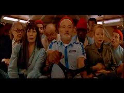
The Life Aquatic • Submarine
Wes Anderson uses color to cue us into key details about his characters. Making his reds highly saturated allows us to really hone in on whenever characters don this color.
ANDERSEN COLOR CHART
The Darjeeling Limited (2007)


Wes Anderson Film Color Palette for Darjeeling Limited
Wes Anderson isn’t only known for his use of primary colors. In The Darjeeling Limited, we see how he uses white and black to great effect.
For the above scene, a young boy has just died. But everyone is dressed in white, punctuated by gold set pieces the brothers walk past. The subject matter is dark, but the scene itself is bright and cheery. Compare that to the other death scene in the movie where the brothers are on their way to their father’s funeral.


Subdued Wes Anderson Style
Black takes over this scene. They’re dressed in the more traditional colors we associate with death. But the way in which they have their arms crossed shows how closed off they are to their emotions. Death may be sad, but that doesn’t mean you can’t rejoice in the life the deceased was able to live.

The Darjeeling Limited • Funeral
The two opposing hues and saturations present two different ideas on how to view death. You can succumb to the darkness and close yourself off. Or you can open yourself up and choose to see beauty in the world.
Related Posts
FANTASTIC MR. FOX COLORING
Fantastic Mr. Fox (2009)


Wes Anderson Palette in Animation
As a cartoon, Fantastic Mr. Fox appropriately has a brighter, more highly saturated color palette. And he uses those extremes to his advantage in the above scene. Mr. Fox finally meets the mythic wolf. The wolf retains that legendary status in this scene by merely being a silhouette against a snowy white backdrop.

Fantastic Mr. Fox • Meeting the Wolf
Throughout the film, we’ve seen storybook-like colors. Those colors are still present in this scene, but they gradually transition into black and white. The contrast helps give importance to the wolf. We know there’s something different about this character compared to everything else we’ve seen in the film.
MOONRISE KINGDOM WES ANDERSON COLOR PALETTE
Moonrise Kingdom (2012)


Anderson Colors: Red and Yellow
When Wes Anderson went from an animated film to a live-action one, he took his cartoon-ish sensibilities with him. From this point forward in his films, his saturation and brightness become far more prominent.
Much of the film has a muted yellow saturation. And the bright colors help give the film a more nostalgic feeling. In modern clothing and architecture, grays have overtaken everything. Making buildings and clothing more lively helps make the film feel nostalgic. It almost gives it a timeless quality.

Moonrise Kingdom • I’m on Your Side
And yellow is an appropriate color to paint his film. It has a more playful nature and is often associated with childhood. Considering how the film is about first love, yellow adequately emphasizes the naivety of the characters, both children and adults.
THE GRAND BUDAPEST HOTEL COLOR SCHEME
The Grand Budapest Hotel (2014)


Typical Wes Anderson Color Palette
It feels like Wes Anderson’s proclivity for color was all leading up to this. The Grand Budapest Hotel contains an assortment of colors. Red, yellow, blue, pink, purple, and so much more is on display. Every frame feels like a storybook picture, and it helps tell a larger than life story.
With such vivid saturation and hues, Anderson creates a movie that doesn’t feel quite real. This affords him various narrative luxuries. When he wants to be fanciful with a plot device, he can do so effortlessly.

The Grand Budapest Hotel • The Escape
The color palette throughout the film has been greatly exaggerated. Therefore, it allows Anderson to exaggerate other aspects of the film. When we see a silly prison escape occur where the prisoners climb a rope over the guards, we accept it more readily. After all, this is the same universe where an entirely pink room exists and no one bats an eye.
MOVIE COLOR SCHEMES IN ANIMATION
Isle of Dogs (2018)


Deep Reds: Wes Anderson Film Color Palette
Wes Anderson went back to stop motion animation for Isle of Dogs. And he brought a vibrant color palette with him.
Instead of having a yellow saturation like in Moonrise Kingdom, scenes are more prone to red. It’s a color associated with love and passion. And it’s an appropriate choice considering the plot is kicked off from a boy traveling to the island to rescue his dog. His love for his dog drives the entire plot, so a red saturation is appropriate.

Isle of Dogs • Banishing Dogs
Wes Anderson has a key understanding of what moods certain colors evoke. And he keeps those connections consistent throughout his films. Therefore, when you’re watching a Wes Anderson film and know what a certain color means to him, you gain greater insights out of the characters and plot.
With this in mind, you can watch The French Dispatch while keeping an eye out for key colors Anderson is prone to using.
UP NEXT
Wes Anderson's directing style
Color is just one key feature of Wes Anderson’s films. His costumes, settings, and themes also connect his filmography together. We’ve broken down each individual component of a Wes Anderson film to see what connections can be drawn. Keep reading to see how color palettes work in tandem with everything else to make a uniquely Wes Anderson motion picture.
Up Next: Anderson's style explained →

Share your vision with elegant shot lists and storyboards.
Create robust and customizable shot lists. Upload images to make storyboards and slideshows.

