
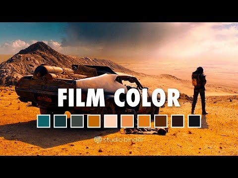
Zack Snyder movies are full of bold color choices. Sometimes this is the color grade, sometimes this is the production design. What drives these decisions, and how can you apply them to your own films?
In this post, we’ll take you into our analysis on Zack Snyder movies like The Watchmen, Batman V Superman: Dawn of Justice, 300, and more to illustrate how color can be a superpower in the hands of the right director.
We also give you a FREE color in film Ebook with 50+ examples from movies.

Watch: How to Use Color Like Zack Snyder

Zack Snyder Movies
1. Superheroes in Zack Snyder movies
It would be unfair to say that Zack Snyder movies are all comic book adaptations. However, even his non-comic book outings, such as the Dawn of the Dead remake or Legend of the Guardians have a superhero sensibility to them.
They’re about larger than life figures. Characters too big for the worlds they inhabit, even if those worlds include aliens, zombies, or the Batman himself.
Zack Snyder movies highlight the superheroes' enormity by using color.
If you're a fan of Zack Snyder's directing style, you'll want to take note of how his use of color is both technical and emotional. Zack Snyder films use color to draw attention to figures in contrast to the worlds they inhabit.
Let's explore how Zack Snyder uses color in his films.
Zack Snyder Color Grade
2. Build monochromatic color schemes
The director of Batman v Superman is, unsurprisingly, drawn to dark themes. Zack Snyder movies often explore the darker side of human nature, and he isn’t afraid to show the flawed sides of our heroes. One way he executes this is by using color palettes with primarily monochromatic, muted tones. His worlds often look cold and harsh, bordering on nihilistic.
Monochromatic Color Definition
what is Monochromatic color?
A monochromatic color scheme is when a single base “hue” is extended out using shades, tones, and tints. Tints are achieved by adding whites, and shades by adding black.
By using varying shades of a single color, the harmony of a scene can either be soothing, or create a bleak worldview (depending on the colors used).
Let's take a look at some examples:
While Zack Snyder may be drawn to darker themes in his films, it doesn't mean he only uses dark colors to depict those themes. The use of monochromatic coloring helps with this, and allows him to choose other colors.

300 Shot List - Made in StudioBinder
You can see the monochromatic color scheme in the shot list above. This scene from 300 is colored a bit differently from the rest of the film.
This is partly due to time, since this scene takes place years before the main story, but it also has to do with setting. This scene takes place on top of a mountain near a wolf den... and the chilly color palette creates emotion.
In Batman v Superman: Dawn of Justice we see monochromatic schemes everywhere. While it's typical to associate Batman with dark tones, here we see brighter hues in a way that still gives us a sense of dread and bleakness.
While the fire-y yellows light up the screen, they are still dismal in appearance and feeling. And even slowly take over Batman's black suit. They are reflective of the destruction in the scene.

Batman v Superman color palette
The worlds in Zack Snyder movies, as fantastic as they are, are not nice places. We are reminded of this in Man of Steel.
The Man of Steel director showcases this with muted, almost washed out color schemes like in Batman v Justice... but this time, in a much darker way.
The monochromatic green/gray dullness paints the scene depressing. The sameness of color also reflects the uniformity of the men who escort the handcuffed superhero.

Zack Snyder uses dark tones in Man of Steel
What's interesting here is that Superman, too, is muted. Unlike, Batman, Superman often appears in a bright blue and red suit, strong and optimistic. Here though, we see dark greens and grays, and a dark suited Superman.
It's dismal, doleful, and in line with his fate in the scene. This seems to be a trend in the Zack Snyder Superman movies.
Because psychology and color have a direct link to one another, your films will only improve when you implement thoughtful color choice.
Check out our FREE masterclass on Filmmaking Techniques: Color Psychology:
FREE Filmmaking Masterclass - Psychology of Color
As another example, let’s look at the only Zack Snyder movie based on an original concept, Sucker Punch.
Sucker Punch is a narratively complex film. The story of a young woman (known as Baby Doll) who is committed to a mental institution. The film slips into surrealism as Baby Doll escapes to a fantasy world she's concocted.
Within that fantasy, Baby Doll imagines her and her friends are warriors fighting impossible monsters.
Snyder uses a mix of dark greens and blues to convey the cold, desolate world of feudal Japan. But more importantly, those cool colors give off a sense of distance. Detachment. It is a dark place inside the mind of Baby Doll.

Zack Snyder Color Palette in Sucker Punch
For the 300 director, bleak, nihilistic themes are never far from the surface. Even if you’re fighting a giant robot samurai and get to be a hero.
Because in Zack Snyder movies, protagonists aren't heroes, even if they wear capes. They exist in dark, grimy worlds and are themselves often extremely flawed people.
That isn’t to say that Zack Snyder films don’t have any heroes...
Related Posts
Zack Snyder Color Palette
3. Vivid associative colors
Zack Snyder movies also make use of associative colors. As an adapter of comic books, Zack Snyder doesn’t have carte blanche when it comes to color.
Dr. Manhattan is neon blue in the film because he’s neon blue in the comics. Superman, Batman, and Wonder Woman’s costumes haven’t changed all that much in 75 years - so there needs to be some level of consistency.

The Watchmen Color Comparison
And it's with good reason that Snyder continues to use these colors. Firstly, superhero fans would probably freak out if you changed their favorite characters' colors. But also, associative colors are helpful for other reasons.
Associative Colors Definition
What Are Associative Colors in Film?
Associative colors in film refer to recurring colors or color schemes connected to an important character or theme. We build an emotional reaction the color because of the association.
For example, yellow, is associated with Uma Thurman's character in Kill Bill... or Bruce Lee in The Game of Death.
But the Watchmen director takes those associative colors and turns them up to an 11. He uses color so intensely, the characters become almost defined by them.
He does this for obvious practical reasons, as well as for the story.
300 is one the clearest examples of this. Aside from inspiring an army of cosplayers to hit the gym, the bright red capes of 300 serve two purposes.

Zack Snyder Color Palette - 300
First, as a practical matter, they help call out our heroes in the chaos of war. The cape quickly calls out to the audience that this is one of the good guys.
Second, they’re a symbol of the courage and virtue of the Spartans. Surrounded by characters would give in to Xerxes’ offers of luxury and wealth, the Spartans stand as champions of freedom. This is just one way that color plays a role in films that have been dubbed Zack Snyder dark movies.
Let's take a look at another example:
Again, we know Dr. Manhattan needs to stick to the script and remain neon blue. But what about glowing neon blue, paired with fire-y yellow?

Associative colors blue and yellow
Snyder stays true to the original comic, but in a way that is fresh and appealing. He uses associative colors to keep the audience aware of character, but then punches you in the face with their saturation and intensity.
You don't have to love superhero movies to appreciate Snyder's use of color. Associative colors are used carefully and creatively in most films, and many directors have mastered this technique.
Related Posts
ZACK SNYDER Color Style
4. Implement color discordance
When you combine the bright associative colors of heroes and the monochromatic drab backgrounds, you create a color scheme that seems to encapsulate the worldview of the 300 director. A kind of ironic discordance.
Discordant Colors Definition
What Are Discordant Colors in Film?
Discordant colors are any deviations from the film's color scheme. Often used to refocus viewer attention to an important person, place, or thing.
For example, the girl in the red coat appearing in the black and white, Schindler's List.
Discordance is a deliberate choice by the director to deviate from the color palettes we've seen above.
The goal is to refocus the attention. Color discordance shines a light on whatever it is you want to highlight - something used often in Zack Snyder movies.
See some more examples below:

Red works well to draw attention

Zack Snyder Color Palette | Batman V Superman
Not just from losing his parents and the destruction of Metropolis, but of the death of Robin, according to a Zack Snyder interview.
That Robin is often associated with red drives this point home even further.
Coloring your film can define your character, strengthen your theme, and create visual moods and masterpieces. But coloring requires a significant amount of knowledge and detail. Read more below on how to use color in your film, with a free ebook on color theory, or take advantage of our free masterclass.
Related Posts
up next
How to Use Color in Film 50+ Examples
Now you know how Zack Snyder thinks about color in his films. If you want to create films and projects that take full advantage of color, make sure to check out our FREE Ebook on Color in Film: Mastering the Color Palette.
Up Next: FREE Ebook on Color in Film →

Share your vision with elegant shot lists and storyboards.
Create robust and customizable shot lists. Upload images to make storyboards and slideshows.

